Introduction
📍 Getting Started
Setting up this frontend locally in your machine requires you to look at the GitLab repo for this project. PPUM Patient Monitor Repo.
📍 Bootstrap 4.X
The codebase development of this project is entirely build using Bootstrap 4.X. In order for you to tweak and harness its full capability, you have to thoroughly read its original documentation.
Its theming in the other hand - that have been done to get its custom look is also based on top of Bootstrap CSS class convention. Future development should follow this similar practice to ensure code maintainability.
FYI, there are no alterations on the original Bootstrap codebase. All new classes and markups are written with the "modifier-classes practice" in mind.
We will talk more about it in this documentation as it progresses.

Containers & How it should be Used
Bootstrap encourages every new element to be nested by .container or .container-fluid. In line with that recomendation,
there are few additional custom containers created in this codebase to accomodate its design. The naming convention of the classes in CSS are self-explanatory.
📍 Homepage Containers
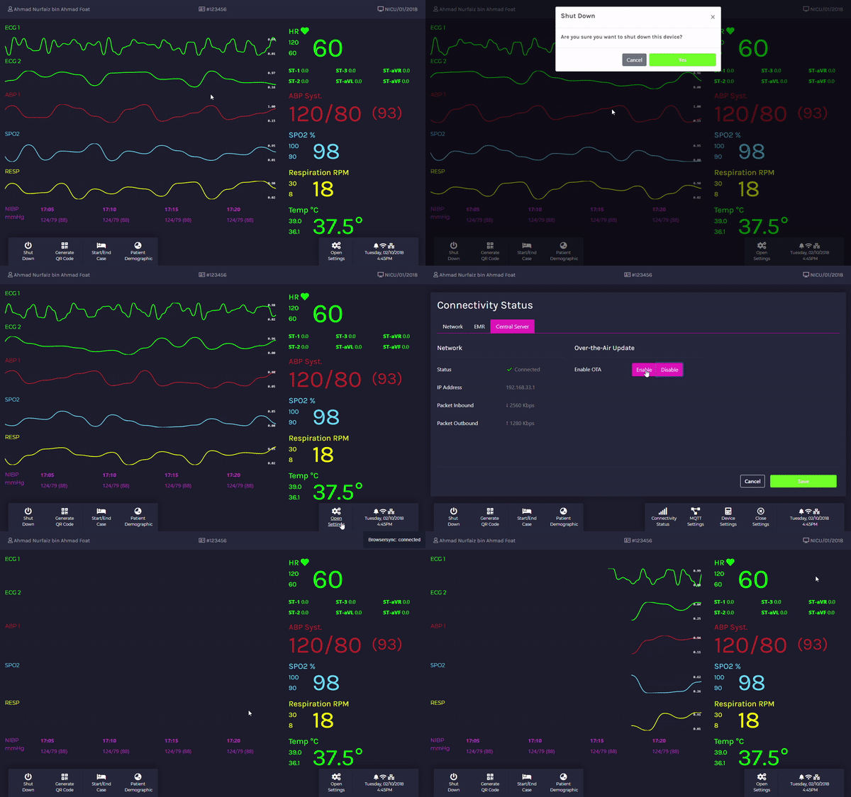
These containers modify the styling for every UI element in the homepage. The containers are (and not limited to);
.waveform-container
.hr-container
.hr-main-container
.hr-avg-container
.hr-main-container-mobile
.bp-main-container
.bp-avg-container
.bp-computed-container
.bp-trend-container
.spo2-main-container
.spo2-avg-container
.resp-main-container
.resp-avg-container
.resp-main-container-mobile
.temp-main-container
.temp-avg-container
.temp-main-container-mobile
📍 Settings Containers
This container modifies the styling in all Settings UI. The containers are (and not limited to);
.settings-container
📍 Documentation Containers
This container modifies the styling in all Documentation UI. The containers are (and not limited to);
.document-container
📍 Menu Dock Containers
These containers modify the styling in all Menu Dock UI. The containers are (and not limited to);
.top-dock-mobile
.dock-menu-container-l
.dock-menu-container-r
.dock-setting-menu-container-r
.dock-menu-container-mobile
📍 CTA Buttons Containers
This container modifies the styling in all Button Position in Settings UI. The containers are (and not limited to);
.btm-cta-container.mqtt-settings
.btm-cta-container.device-settings
.btm-cta-container.emr-settings
.btm-cta-container.ota-settings
UI Modules
There are four (4) main modules that are paramount to this codebase namely; Buttons, Forms, Keyboard and Modals. Each of this module classes will modify Bootstrap's original styling. Therefore, it must be used together with Bootstrap method of calling any UI element in the markup.
📍 Buttons
These containers modify the styling for all Buttons UI. The classes are (and not limited to);
📍 Modals
Any usage of Bootstrap modal must be called together with these classes to enable full modified UI.
.modal-content-ppum
.modal-header-ppum
.close-ppum
.modal-body-ppum
.modal-footer-ppum
📍 Forms
Any usage of Bootstrap forms must be called together with these classes to enable full modified UI.
📍 Keyboards
By right, you do not have to amend the styling of the keyboard since it is all handled by Javascript insertion. However if you're planning to do so, you may look for the SCSS file in the modules folder.
Colours and Branding
In order to cater dark room ambience as well as to limit eye strains. This UI comprises of seven (7) colours altogether.
📍 Colours
Calling this colours into the UI require the SCSS to call for specific variables, i.e border-color: $ppum-darker-pink;. The colours selection is as shown;